Arial is a solid choice
Font files are heavy assets, they are unnecessary overheads. I contend that the only typeface you really need is Arial. In my view Arial is a strong choice for web applications, portfolio sites and writing on the web. I realise that our hands are sometimes tied by brand guidelines and in-house requirements. In that case, tough luck, comrade.
If you've decided that the best part of your website is the content or it's utility, then the typeface you're expending bandwidth on is a waste of your visitor's time. Don't bother.
There's plenty you can do with the Arial typeface.
Firstly, Arial has sufficient weights. It features real italics, bold and small caps.
Font weight examples
Font Weight 100
Font Weight 200
Font Weight 300
Font Weight 400
Font Weight 500
Font Weight 600
Font Weight 700
Font Weight 800
Font Weight 900
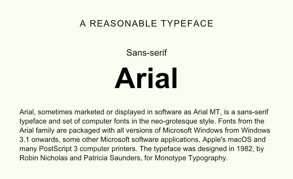
Arial comes with most operating systems, both mobile and desktop. By using Arial, you can be assured that webpage content will look consistent for all visitors. Arial is an ideal sans-serif typeface for digital displays. Belonging to the neo-grotesque family of typefaces, Arial's form suggests simplicity and neutrality.
Top tip: avoid non-standard fonts for your web application interfaces. Grasping new interfaces can be challenging. An unfamiliar typeface will make everything feel a little more alien.
It is the composition of type that makes your website feel nice. It's the scale, lineheight, padding and weight.
Thomas.